
Monday, August 16, 2010
DMA133 - Web Banners
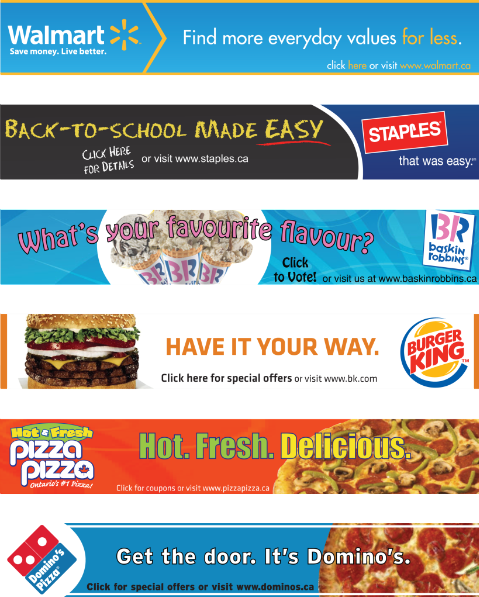
For DMA133 we had to create six web banners for six preselected corporations. We had to try and complement their corporate logos through use of colour, typefaces, and design. The current slogan and website had to be included as well.
Predatoring in Style.
Besides the physical board and chronicling the process, a style guide had to be developed for the skate deck. My style guide includes colour options for the primary image and background that, while in the end not selected, had been considered.
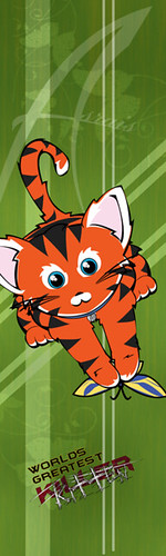
Board Name: Pure Terror
Vector Elements: Cat & butterfly, diagonal lines
Raster Elements: Background texture, background butterflies
Typography: BatmanForeverAlternate, Aggressive Angry Baby Killer
Texture: Picture of cloth, edited in Photoshop to create background
Branding (and name): 'Asrais', located on background and on cat's collar
The Process of Preditation.
Preditation. The act of a predator, similar to predatoring.
It's not an actual word, but some people on the internet would like it to be.
For DMA179 we got to create a skate deck design. The theme was 'Predator', but as long as the design could realistically be related back to the theme there were no limitations.
The final design had to include: vector elements, raster elements, a texture created using a physical base, typography, a branding theme, and my name.
The Process of Preditation:
1. As with the other projects in this course, the skate deck started off with a mind-map which featured 'Predator' in the center and splintered off in frenzied logic from there.
2. From the mind-map, the type of predator for the board was selected. After much indecision, I chose to do a zombie. Yes, a zombie. Those aware of my final design just stick with me the next few steps (ie, anyone that looked at the two newer posts).
The zombie was to be sitting and chewing ('nom noming', in fact) on a juicy brain. Extending from him would be a sinister shadow. The board background would be covered in brightly coloured skulls and brains. Above all, the zombie would be adorable.
3. While beginning to trace out my zombie in Illustrator, Isabella the cat (in desperate chase of an insect) almost hauled my laptop off the table I was working on. Several unkind emotions were felt towards her. "YOU, are the world's *expletive* deadliest predator!"
~~~And, design change.
4. After several failed attempts at making a cat that looked like a cat, I finally had a fearsome image to work with. In Illustrator I traced my kitty, drew him a butterfly to slay, and added colour. Pure terror.
5. I like the way cloth drapes and folds, and took a couple pictures of my lovely green sheets to use as my texture.
6. The sheets received a makeover in Photoshop: they were blurred, texturized, and received a gradient. Lines were applied on top to make the background more interesting. Butterflies were added to the background as well because I was unsure that my raster element was 'raster enough'.
7. For type, I selected the phrase "Words Deadliest Killer" with "Killer" crossed out and "Kitten" scratched on top. Varoun suggested I change the word 'deadliest' to 'greatest' so that the two phrases - "Worlds Greatest Killer" and "Worlds Greatest Kitten" would have completely different meanings. I like the way he thinks. I wanted "Words Greatest Killer" to be a strong, almost super heroesque (making up words all over the place today!) font and "Kitten" to resemble scratches.
8. And then I cheated. 'Asrais' is the online name I've been using in games for years. So, for this project, I've chosen it to represent both my name and the brand.
"But Megan!", you say. "A cuddly, wuddly kitten doesn't seem very skate culture."
Oh, but it does. The beautiful thing about skate boarders is that they don't fit into one tiny, little box. The most important aspect of a board is the quality of materials used - design preference is secondary. If a person has enough money to spend on a board with a great design, then the one they chose reflects their personal artistic tastes. When significant money is involved - and you don't have a lot - you pick something YOU like, not something your friends will like. Just as I enjoy different art than others taking the exact same course as me, or who play the same online games, all skate boarders don't enjoy the same things. Type 'skate deck' into Google and the images range from vibrant to mute, borderline vulgar to political, pop culture to classical, and everything in between.
The future is going to suck. For food.
In class we had to create kid's meals for four different time periods - for cavemen, the middle ages, the wild west, and the future.
I'm of the opinion that the future is going to suck for kids. I foresee low-calorie dehydrated food pellets and educational 'toys' that forget they are meant for fun. I desperately hope to be wrong.
Someone time-travel and find out, thanks!


I'm of the opinion that the future is going to suck for kids. I foresee low-calorie dehydrated food pellets and educational 'toys' that forget they are meant for fun. I desperately hope to be wrong.
Someone time-travel and find out, thanks!
Subscribe to:
Posts (Atom)