Wednesday, July 14, 2010

Elf: wtb [Name]

For DMA101 we had a project to submit a sketch (or line art) and then use Illustrator to trace/colour it. I did an elf, but she has no name. She's been nameless for nearly a month now and I'm beginning to feel bad for her.

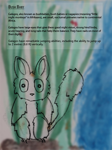
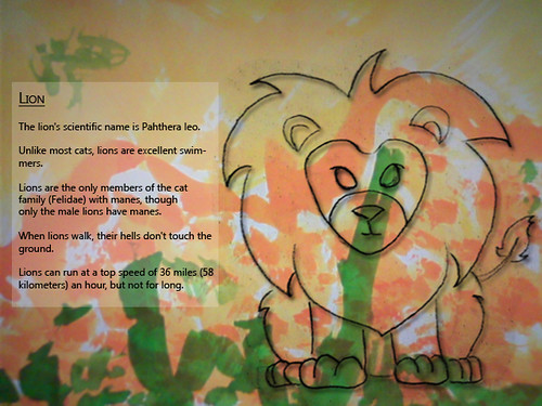
I'm still not completely satisfied with how she looks, but I am quite pleased with how she's progressed from the initial sketch.


Photobucket


Elf

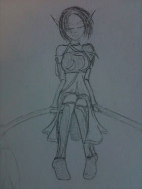
It may be the crazy talking, but I personally find drawing lines in Illustrator to be one of the most relaxing experiences on the planet.

DMA133 - Ransome Notes.

The third project in DMA133 (and the last one with Aviva) involved preparing us for our future as criminals when we'll need to make really intimidating ransom notes. Or it might have been about typography and understanding visually how to balance text.

It was definitely one of those.


Photobucket


Photobucket

The exercise involved constructing any two words of at least ten characters each out of letters ripped out of magazines. The rules to our letters were that no two consecutive letters could be the exact same size, font, or colour. Once our letters had been arranged to our liking, we had to copy the word out on tracing paper. Through the use of subsequent tracings, we had to establish a more natural visual balance between the varying styles of letters.

DMA133 - Pretty Pictures.

The second assignment in DMA133 focused on exploring some of the elements and principles of design through photography. Working with a partner, we had to go outside (like, outside, in the air and sun) and take 30+ pictures. From those images we had to select the one that best represented each of the following words: unity, balance, contrast, scale, emphasis and rhythm.


Thanks for being a great partner, Varoun!

DMA133 - Four Squares walk into a bar...

The first assignment in DMA133 was intended to introduce us to thinking like designers. The aim of the exercise was to try and find creative solutions to a problem. Given four squares, all of the same size, we had to create four images to express the following words: order, playful, increase, tension, congested and bold.

Like much in both design and life, perspective was often key to solving the puzzle.

Tuesday, July 13, 2010

Super Awesome Update Fun-time.


Up to now, I have failed rather spectacularly at updating my blog with material from my other courses besides DMA179.
Thankfully, this is simple to correct.

Equally thankfully, the internet is a kind mistress and never without an appropriate meme for a situation.

Squish!

I assembled the prototype cube for our typography assignment in order to get a better idea if I liked how the colours and type were laid out. It was a pretty good idea and worked marvellously well until I squished it with my laptop.

Oops.
Squished Cube

Larger, less crushed cube will be posted next week. :D


But it smells and tastes like vanilla!

I almost feel cruel posting the 'Vanilla Menu' online since no one can enjoy how it smells. Painting with vanilla extract is highly enjoyable.

It smells absolutely delicious, but you'll have to take my word for it.


Vanilla


Sunday, July 11, 2010

Adventure Quest Adventures.

Super Morlock Adventure Quest:

June 30th we (Ali, Celia, Colleen, Cosmin, Enoch, Gerard, Jessie, Joan, Joe, Luis, MJ, Terry, Troy, Varoun, Wade, Wing, & myself)* headed out to terrify the locals. Our team name is 'Team 2/3'.

'Cause, you know, it seemed like 2/3 of the class was in it...
Look out, world, creative minds at work here!


I promise my good night picture is a night, but having no flash on my phone the image came out black without the light on. =(

Want more? Go look at all of Joe or Jessie's pictures!
There are a ton of really great ones there! If for some reason anyone wants any of my fuzzy pictures, they are here.

*Thank you Ky for taking all the great group shots!!

Saturday, July 10, 2010

Go Team!


Sure, there are a lot of really great reasons to trace the Detroit Pistons logo. These reasons can range from supporting your favourite team to practicing different types of shapes, and beyond.

But why lie?

It's all about the flaming horsey, and we all know it. Oh, there are those that will celebrate and praise the various aspects of the Pistons logo but the truth - the real, solid, undeniable truth - is that we all just wanted to draw the little flame pony.

And so I raise my hypothetical glass to the Pistons: Go Team Flaming Pony!
Flame on, little horsey, flame on
.

Thursday, July 1, 2010

Paper Zoo!

Line art zoo animals make me think of Zoodles.

Anyway, here's the zoo! All animal info is from Kids National Geographic or Wikipedia.