That class was so much fun. I miss our group!
Friday, December 17, 2010
Walk the Line
Early in the semester we had an assignment to re-size Flash banners. While not particularly glamorous it was a good exercise for practicing re-sizing and seeing how fast it could be done, since realistically there is a lot of banner re-sizing in my future.
The banners were for Walk the Line. Prepare to be assaulted by floating heads!


The banners were for Walk the Line. Prepare to be assaulted by floating heads!
Yeh Duh.
So I was trying to figure out how to organize my images so I could upload them to Photobucket for placing them on my blog. I couldn't decide whether to link to them or slide-show them or just throw them out into the snow and let them fend for themselves.
I then realized. Hey, I have webspace - I can host my own stuff. Why am I using Photobucket?
Thankfully, the internet has the perfect meme for such a moment.

I then realized. Hey, I have webspace - I can host my own stuff. Why am I using Photobucket?
Thankfully, the internet has the perfect meme for such a moment.
Nissan Superfun Flash Site
For our flash class we had to take code we'd learned and apply it to the creation of a Nissan-themed mini-site. We had to take code involving children and stages and apply it to the time-line version of the site that had been completed way back in week 6. My parents follow my blog. I just officially lost them. I may have lost myself. But the point is:
FLASH.
It's pretty. AND FLASHY. Click the image. :p

Ultimately, I understand how to apply what we learned to the creation of another site - which I suspect was the point.
FLASH.
It's pretty. AND FLASHY. Click the image. :p
Ultimately, I understand how to apply what we learned to the creation of another site - which I suspect was the point.
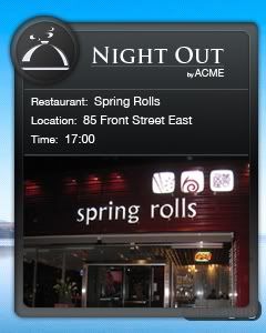
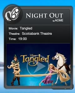
When Androids Attack!**
**There are no actual attacking androids. yet.
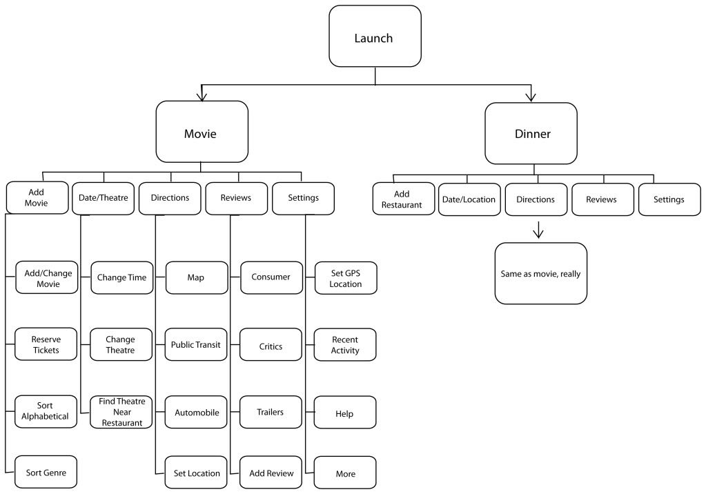
These are the finished design for the Android app, there are only two shots of the app itself (one landscape and one portrait) but my hope is that (with the possible aid of the site map) how it's intended to work is clear.


These are the finished design for the Android app, there are only two shots of the app itself (one landscape and one portrait) but my hope is that (with the possible aid of the site map) how it's intended to work is clear.
Cr(eight)iv
Group projects. You win some, you lose some.
Throughout the term we had group project to redesign and apply basic code to a website called Cr(eight)iv - the actual name using the numeral 8, not (eight), but it was requested by the client that we not use their actual name so as to not divert search engine attention from them.
The first part of the assignment as to develop three potential designs for the site.
The three designs I came up with were:


I used the third design, admittedly because it was the easiest to slice for coding. I really wasn't sure if I could successfully code something more complicated - though now I am confident that I can. The coded bit can be found here. It's honestly really basic stuff - but it works and I'm proud of myself for getting it done.
This project involved a lot of frustration. There were basically 'group issues' plaguing the entire class - likely stemming from the fact that this was one of the first group situations where we didn't have control over who was in our group. Thankfully it's done now, and the Eros project renewed my faith in group-work. :D
Throughout the term we had group project to redesign and apply basic code to a website called Cr(eight)iv - the actual name using the numeral 8, not (eight), but it was requested by the client that we not use their actual name so as to not divert search engine attention from them.
The first part of the assignment as to develop three potential designs for the site.
The three designs I came up with were:
I used the third design, admittedly because it was the easiest to slice for coding. I really wasn't sure if I could successfully code something more complicated - though now I am confident that I can. The coded bit can be found here. It's honestly really basic stuff - but it works and I'm proud of myself for getting it done.
This project involved a lot of frustration. There were basically 'group issues' plaguing the entire class - likely stemming from the fact that this was one of the first group situations where we didn't have control over who was in our group. Thankfully it's done now, and the Eros project renewed my faith in group-work. :D
Eros Tea and Coffee Garden
We had a group project to create a website mock-up and the branding for an imaginary Tea-house called Eros. As a client they wanted a site that focused on their booming teas and had a Telus or Apple type feel to it.
My initial idea for the design was along the lines of this:

The problem was that, although the picture in the background was nice, the site was becoming far too busy and cluttered when the client was looking for clean and simple.
Not to be discouraged, I took the design concept that my super awesome partner, Enoch, had been working with and started modifying that.

This was my final design for the site. I like it because it represents what a group collaboration should be - by working together we came up with a design that neither of us would have reached as quickly on our own and neither of us felt hindered by the other during the process. It's nice to have someone next to you while working that has the honesty and interest to look at the hideous green line your about to apply to an object and say "... you do know how tacky that looks, right?".

My initial idea for the design was along the lines of this:
The problem was that, although the picture in the background was nice, the site was becoming far too busy and cluttered when the client was looking for clean and simple.
Not to be discouraged, I took the design concept that my super awesome partner, Enoch, had been working with and started modifying that.
This was my final design for the site. I like it because it represents what a group collaboration should be - by working together we came up with a design that neither of us would have reached as quickly on our own and neither of us felt hindered by the other during the process. It's nice to have someone next to you while working that has the honesty and interest to look at the hideous green line your about to apply to an object and say "... you do know how tacky that looks, right?".
Client Mock-Up Mini
We had an assignment to take the two clients whose sites we'd redesigned and make mock-ups of apps or mobile sites for them based on those designs.
I chose to make apps for both companies for the assignment and intend to create ideas for their mobile sites over the break.
For Dystar the app is supposed to be something that would be aimed at chemists or dyers. The idea is that it would take the brochures produced by their subsidiary Color Solutions International make make it a digital app that would provide and/or analyze color swatch information.


For NCC the app is a fairly typical radio station app, the difference being that it would focus specifically on stations owned by or associated with them.


I chose to make apps for both companies for the assignment and intend to create ideas for their mobile sites over the break.
For Dystar the app is supposed to be something that would be aimed at chemists or dyers. The idea is that it would take the brochures produced by their subsidiary Color Solutions International make make it a digital app that would provide and/or analyze color swatch information.
For NCC the app is a fairly typical radio station app, the difference being that it would focus specifically on stations owned by or associated with them.
Friday, December 10, 2010
A sketchy situation?
Oh puns, how much better the world would be without you...
For most of the semester, we started off our pre-production class with warm-up sketching. We had to submit our ten favourite sketches for marking.
I've never taken any classic art courses, so anything involving theory like perspective, or bone/muscle structure was exciting for me. Drawing stickfigues that could potentially be the foundation for a person instead of my usually foundation for a treant (spell check doesn't recognize treant or ent? For shame.) was also thrilling.
My favourite sketches are those that look passably male. Where to even begin drawing men generally confuses me. The hips that aren't hips, the lack of curves but still needing to have shape. Even when drawing while young I'd reach a point of frustration and just make it female.
When in doubt, throw boobs on it.
So, yes, drawing an almost male thing is a triumphant moment.
Archaic Scribblings, and the High Tech Phone Who Loved Them
In our Photoshop class we were tasked with creating mock-ups for Android widgets that would belong to an app about eating out and/or going to a movie. The widgets for Android phones come in six fun-filled flavours and a mock-up has to be made to represent each size.
Below are the initial concept sketches. The first image is the basis for all the widgets.
As a warning: if you squint and pretend they are written in code my penmanship is less offensive to the eyes.
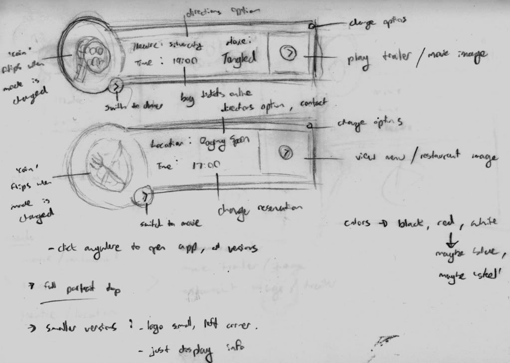
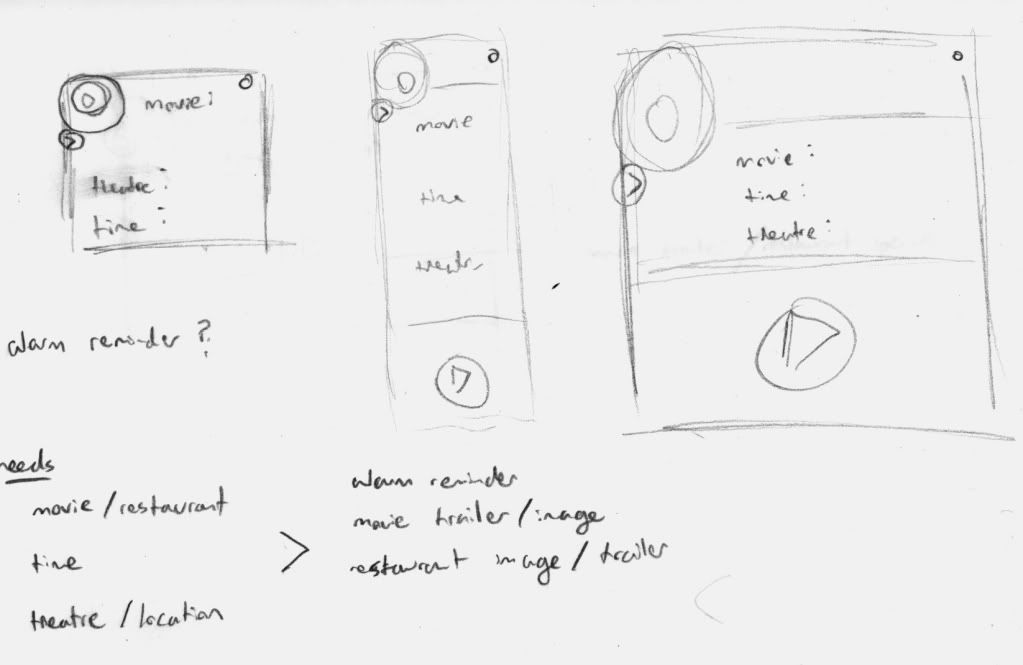
Squint harder.
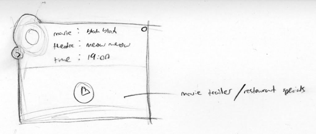
Below are the mock-ups for the 240x300 - 3x3 Portrait widget. As the largest portrait widget, it will be used as the base for modeling the rest.
(and for those who squinted, yes, the current model is missing at least two features)


Wednesday, December 8, 2010
Storyboards of Awesome Fun
For our pre-production class we had to create the storyboards for an intro animation to our portfolio site.
Sketches
Final
Sketches
Final


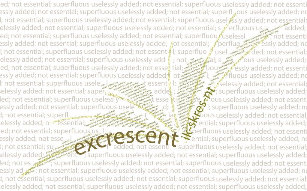
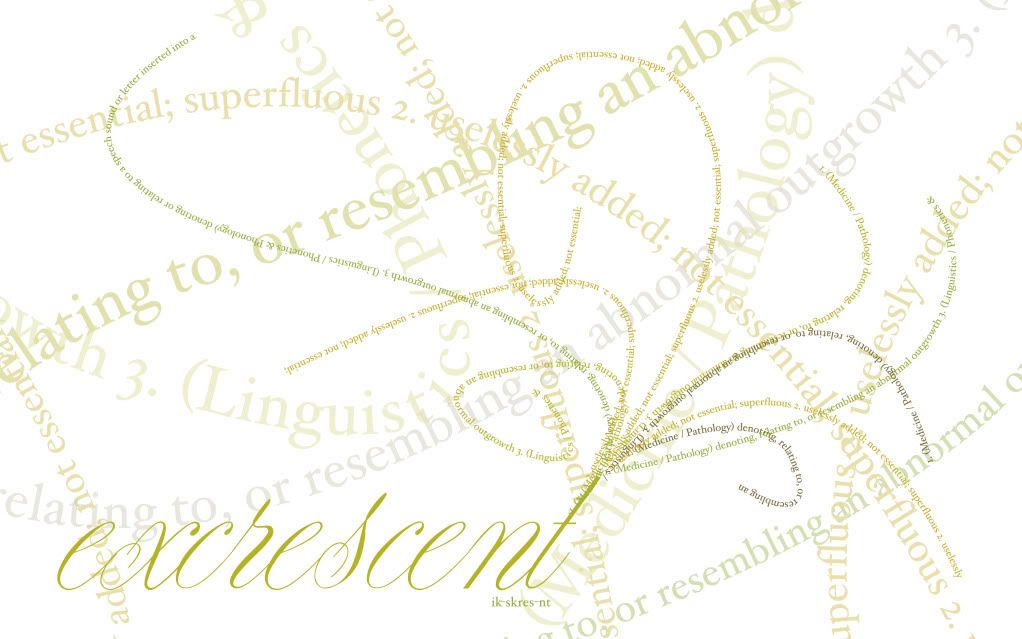
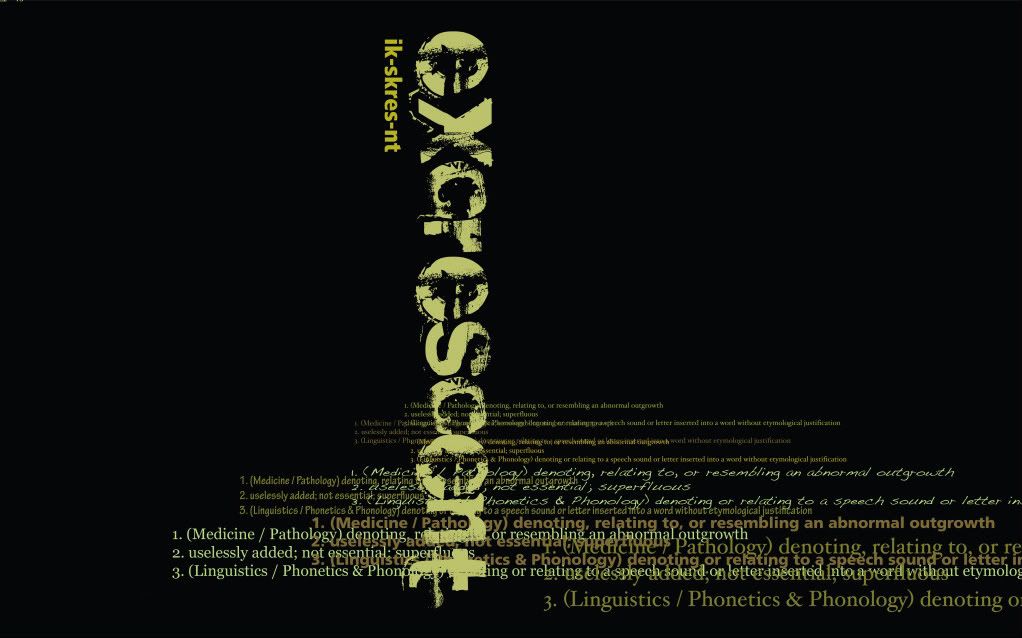
Excrescent
Our final typography project was to take an obscure word and use expressive type to show the meaning. I used the word 'excrescent'.


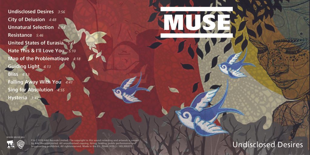
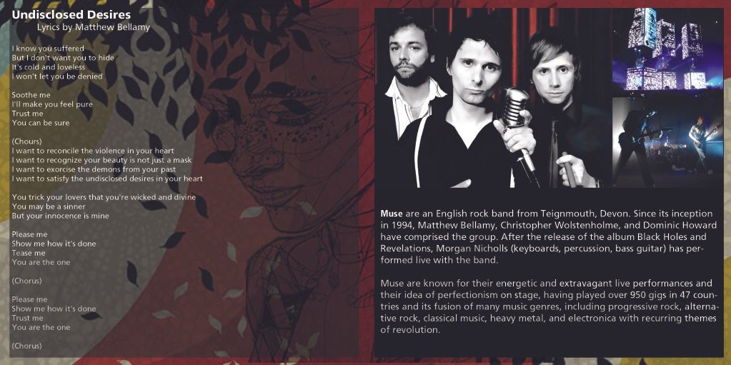
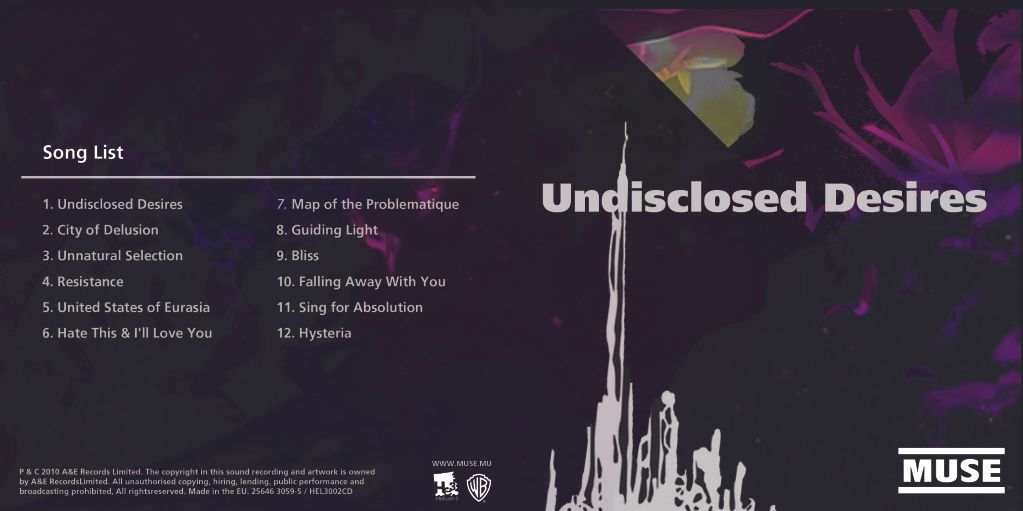
Disclosed
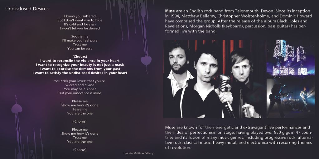
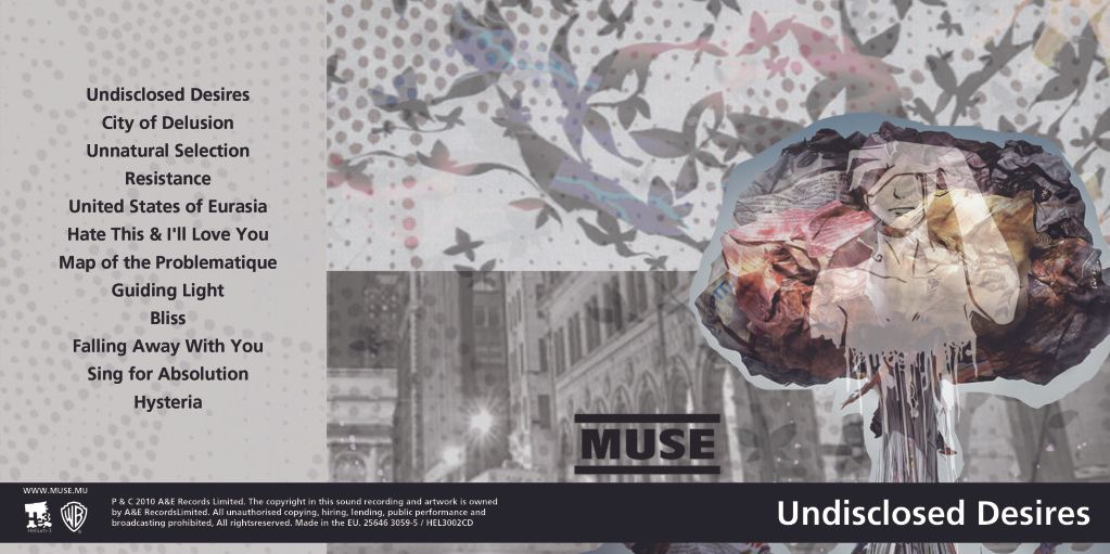
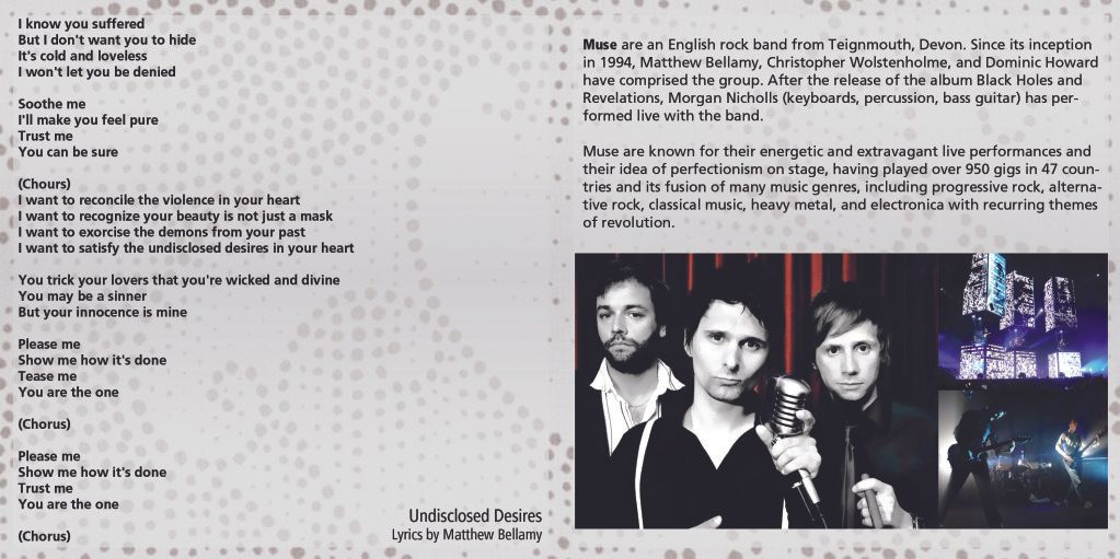
For typography we had an assignment to create three album inserts for a music group of our own choice. The design had to incorporate type (obviously) and collage. I chose to use Muse.


Sunday, November 28, 2010
Neither the warmth nor the depth
Depth of field assignment!
Don't judge the models.
They are shy.
Close

Mid

Far
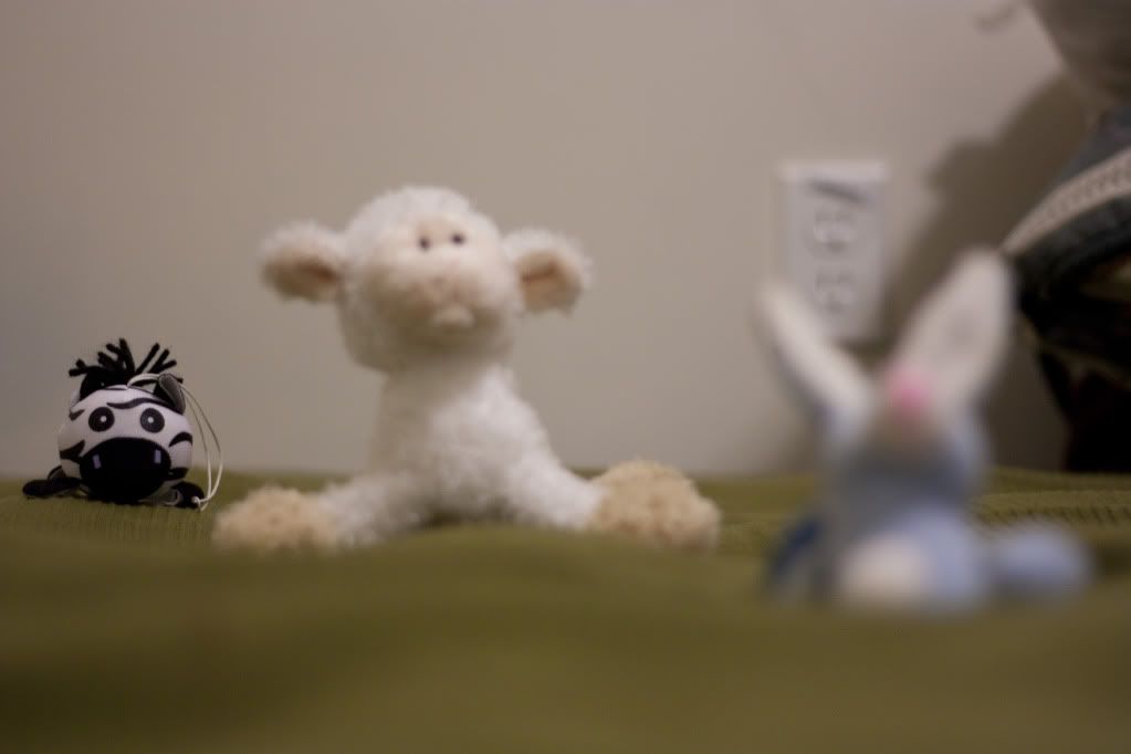
All
Don't judge the models.
They are shy.
Close

Mid

Far

All

Monday, November 22, 2010
Kensington Market
Earlier in the the semester we did a tour of Kensington Market. We had to create a small book or brochure from the pictures.
During this assignment I learned one of the basic rules of printing: For the love of all that is sweet and fuzzy, don't bleed all over the prints!
Silly paper cuts. =/
During this assignment I learned one of the basic rules of printing: For the love of all that is sweet and fuzzy, don't bleed all over the prints!
Silly paper cuts. =/
Monday, November 15, 2010
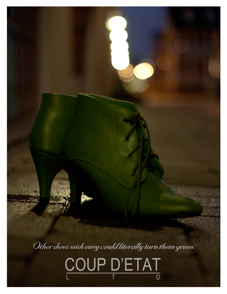
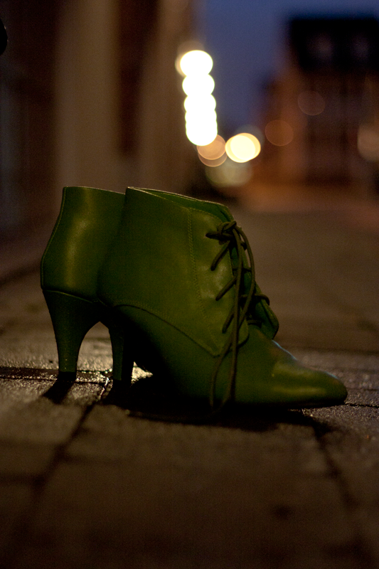
Coup D'Etat
The shoe ad and raw shoe image for a photography assignment.
My boots are violently green and totally awesome.
My boots are violently green and totally awesome.


Sunday, November 7, 2010
Jack in the Box(es)
On Tuesday there was an in-class assignment to re-size banners celebrating the 4 hour season premier of 24. History will no doubt look back on the fact that 24 is not actually returning as, at the very least, a minor miracle.
Sadly I was not in class as the migraine fairy has decided to visit me frequently this semester. Absence not being an excuse for not doing, here's Jack:
Sadly I was not in class as the migraine fairy has decided to visit me frequently this semester. Absence not being an excuse for not doing, here's Jack:
Client Mock-Up v1
One of our major projects is to take two existing companies or organizations and create mock-ups of a new design for them.
One of the companies I chose is Newcap Radio, a broadcasting company.
Full size image of the content page.
The other is Dystar LP, the North American member of Dystar Global - provider of products and services for the textile and leather industry.
Full size image of the content page.
One of the companies I chose is Newcap Radio, a broadcasting company.
The other is Dystar LP, the North American member of Dystar Global - provider of products and services for the textile and leather industry.
Style
As an exercise in story-boarding we were assigned to create story boards for a web banner for a BlackBerry product. I decided to use the BlackBerry Style, a new addition to the BlackBerry family.
The banner had to follow BlackBerry's branding guidelines and contain some type of incentive to encourage a person to click on it.
The banner had to follow BlackBerry's branding guidelines and contain some type of incentive to encourage a person to click on it.
Hunting Witches


Black and White Berries
In class we worked on a mock-up for a BlackBerry site. It was a 'light' version and based on it we had to create a 'dark' version. The idea being that a simple colour change can make a site look completely different and easily provide a client with more options.


Subscribe to:
Posts (Atom)