In class we worked on a mock-up for a BlackBerry site. It was a 'light' version and based on it we had to create a 'dark' version. The idea being that a simple colour change can make a site look completely different and easily provide a client with more options.

Using our skatedecks from last semester, we created a possible website layout for an imaginary gallery showing of deck art called Air Rider.
These were my initial ideas for the sites splash and content pages. I wanted it to look kind of like a magazine.
For our redesigns of the site a standard navigation bar cannot be used, so that will be a fun challenge.

 Back in first semester we used Illustrator to simulate 3d objects. We had an assignment to create three different scenes which I managed to lose into the black hole that is my external hard drive.
Above are two of the scenes.
The third was stuffed back into the black hole for being really terrible.
Our second typography exercise was to take a poem or portion of a song and express it using type and image. I used the poem "Hope" by Emily Dickenson, though the reason for it's selection had largely to do with just having covered the poem in poetry class.
It wasn't completely successful as I used too many members of the same type family, but learning would be difficult without mistakes.
A quick internet search reveals 137 words which contain 'mem'.
Oh yes, there could have been puns. And they would have been terrible.
Our first exercise in typography was an exploration of visual hierarchy. We were to pick a letter from either the Greek or Phoenician alphabets and create three compositions for it. Each composition had to contain the same three elements (the name of the letter, the symbol for the letter, and a small piece of text about the letter), but the element that was dominant had to be different in each.
I chose Mem, from the Phoenician alphabet.
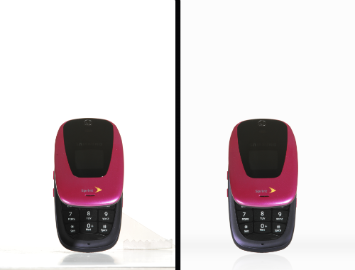
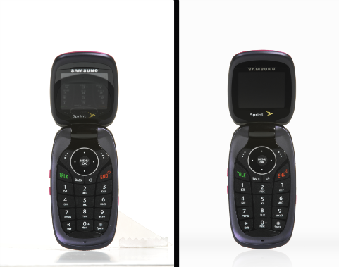
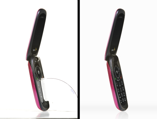
Sprint phone comps for Photoshop class.
It took approximately an hour to complete.
I tried removing the stand and the tape from the second image with mixed results. It looks okay as long as you squint and don't look too close.